
Redefining THE Mobile Reminder Experience
Individual Project @ College for Creative Studies
September 2015 - November 2015; UI Updated December 2020
User Research, Journey Mapping, Prototyping, User Testing
THE BACKGROUND
College for Creative Studies collaborated with Global Automotive and Mobility Innovation Challenge to help small business owners and entrepreneurs to create better innovation initiatives. The UX Design students were assigned to explore design opportunities from their daily lives and create meaningful experiences for them. Through initial observations and discussions in a focus group activity, I found out that there was an outstanding theme among the small business owners that they were always busy with their overwhelming schedules and to-do items, for both business and personal lives.
CENTRAL QUESTION
How might we help small business owners to reduce stress managing their busy lives?
DESIGN SOLUTION
A series of personal assistant features integrated with Android OS.
USER RESEARCH
To understand the users and their stress problems, I did two rounds of interviews with 7 small business owners.
Research Questions:
What makes users feel stress, and why?
What are their current practices to reduce stress?
I originally planned to interview the participants. However, I did not get much insightful information during the pilots. Emotions like stress mostly occur subconsciously, it was challenging for the participants to recall it holistically.
As a result, I used the Triad Task method from Cognitive Psychology to explore.
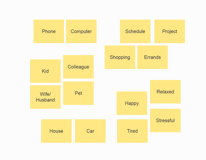
Step 1: The researcher generates a wide range of items that are related to the topic
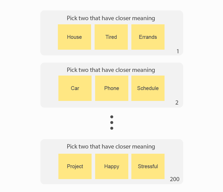
Step 2: Participants pick the closer pair from all the combinations

Step 3: The reseracher ranks the result
Items showed a closer relationship with stress:
Phone (15)
Schedule (8)
Kid (6)
Project (6)
Study 2: Interview
The interview questions are unfolded around
Walking through a scenario associated with stress (which might involve phone, schedule, kid, and project)
Impacts stress created in the scenario
Methods they tried to mitigate the stress
Based on the result, I created a typical user journey that the product should base on:
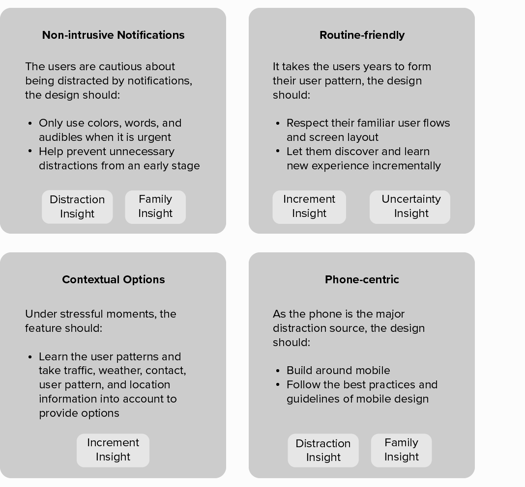
Insight 1: Distraction
Business owners are always on the job. They are constantly distracted by emails, messages, and calls. Not having quality time with themself, or family is causing stress in long term.
The phone is the major carrier of those distractions. They want to disengage with it once in a while but they fear of missing out on important information.
Insight 2: Increment
Business owners are always developing their own ways to effectively manage schedules into their routine. It is incremental.
Most of the routines are built around Operation System and default apps.
Insight 3: Family
Although most family members understand and are supportive of the business owner’s career-oriented busy lifestyle, business owners are stressed about not spending enough quality time with family.
Insight 4: Uncertainty
Business owners are always living and dealing with uncertainty. However, they are trained to organize and control as much as they can.
Synthesis into Design Principles
DESIGN DEVELOPMENT
I used an iterative approach to develop a systematic solution based on the guiding principles
Ideation
Numerous ideas are generated under the guiding principles. I selected the Schedule Assistant, Call Assistant, and Contextual Lock Screen to develop a systematic solution.
User Flow
Iterations
I conducted 4 rounds of user testings and improved information arrangement, user flows, function prioritization, and icon usage.
Finding 1: The visual attention should be on the main user flow
The users would love to see alternative suggestions when the first suggestion is very close to what they have in mind. However, if this feature over-complicates the UI, it could compromise the experience for normal usages.
To add the functionality for alternating between suggestions, I created 3 proposals using different gestures to alternate. Swiping was preferred, as it took the least visual attention away to the main usage. However, the additional elements made it harder for the user to understand the purpose of the whole screen.
Improvement
The visual elements should communicate option alternation while help communicating the calendar modification suggestion idea. I added boxes under the original calendar and the suggested calendar to draw more visual attention. Then I added the edges of the alternative suggestion boxes to hint at the swipe gesture. The proposal was well-received by the participants.
Finding 2: Familiarity comes first, fewer user steps comes second
If the users do not find exactly what they want in the suggestion, they would reject it and do it manually.
Anything more than the suggestion pop-up itself is too much for incremental learning. The suggestion modification function gets the job done with fewer user steps. However, because the users do not know what will happen after hitting the modification button, they would prefer to use their familiar methods.
Improvement
Modification functions are removed to keep the User Interface clean. I made sure the suggestions can be easily dismissed and it does not take any additional steps for the users to switch back to their own methods.
Another Case
To prevent the user from distracting the business owner because of not reading the status, I moved the “Call” button away from the default position and added the most appropriate “Request Callback” and “Schedule a Call” options. It performed poorly. It forced the participant to learn two new things at once, and it also made the area cluttered.
Then I iterated it to focus on the preferred option among the two and made the area clean. However, the participants were still not happy about their call button getting relocated. The Iteration 2 proposal tried to address the familiarity issue but had less success in preventing the user from hitting the “Call” button before reading the red status.
Improvement
I added a user step. It successfully let all participants understand the unwillingness of getting distracted. Then the participants viewed the new options as being “considerate” rather than “annoying”.